An underlying theme of multiculturalism and inclusion were primary motivators for Grade 12’s Autum Kim, when she sat down to design some art that would encapsulate Langley City.
And her vision for the community reasonated with the judges tasked with picking imagery that now adorns street poles throughout the downtown.
Each year, the City of Langley rotates spring, summer, and fall street banners to enhance the look and feel of the community and add to the character and charm of downtown Langley.
This year, the summer street banners were scheduled to be replaced and City decided to create the first-of-its-kind street banner call to artists.
The call was open to emerging and established artists who could create two pieces of complementary artwork that would showcase that “character and charm” of City of Langley, explained communications officer Samantha Paulson.
The City was looking for artwork that depicted the work that the City is doing to support active, healthy lifestyles through arts, culture, and recreation. Kim’s work achieved that, she said.
“While these two banner designs reveal several aspects of Langley, I mainly highlighted these three topics: diversity, multiculturalism, and inclusivity of Langley to exhibit the city’s vision, “The Place to Be”,” said Kim.
Not only did the young artist receive recognition for her art, but she was also awarded a $1,000 honourariaum for her banner designs, two full-sized prings of each, which were presented to her recently during the City’s Community Day festivities.
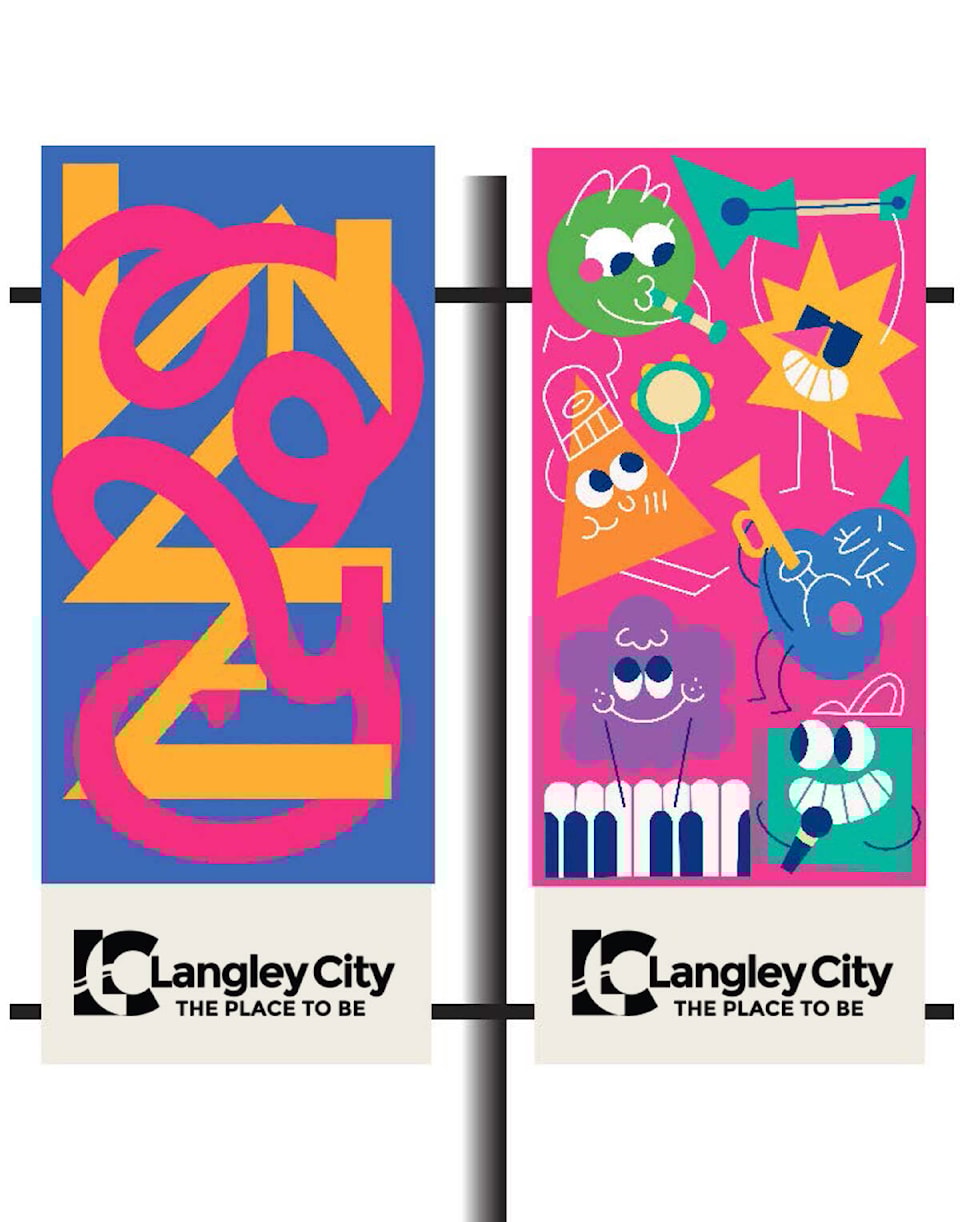
Asked to explain her inspirations for the banners, she said one is a typography artwork of Langley.
“This design represents the diverse and tight-knit community of the City through the intertwined letters. One letter design is yellow and has a stern look, while the other is pink and looks playful. These two-letter designs contrast with each other both in terms of colour and shape, symbolizing the diverse community of the city filled with people of various races and cultures. Despite their differences, these two designs come together to be complete, to become Langley,” said the young artist.
The other banner, said describd as an illustration that showcases the multiculturalism, inclusivity, and exuberance nature of Langley City.
“Each character has a unique shape and colour to them, symbolizing the residents of Langley with various ethnicities, identities, and backgrounds. Every character embraces each other’s differences and gathers as a group,” Kim said.
Since there are several upcoming community events with music, the instruments of each character foreshadow those events and she hopes they help spread excitement for summer.
“It also reveals how Langley supports healthy lifestyles and community gatherings through these recreational events,” Kim explained.
During the recent presentation ceremony, Langley City thanked all of the artists who participated in the banner call out.
“We were overwhelmed with the response we received,” Paulson said. “The committee had difficulty picking the winning submission. We look forward to providing another opportunity for new, amateur, and professional artists in the near future, so please stay tuned.”
READ MORE: Young artist designs banners for Fort Langley Community Association
.
Have a story tip? Email: news@langleyadvancetimes.com
Like us on Facebook and follow us on Twitter.